Wednesday, March 23, 2011

Composition: Color

Activity 14: Color Echo


For this activity, we were asked to find a picture with a simple background. I found the image of a pair of lips on Google. I chose it because it had interesting colors that would fit nicely for this assignment. I used Photoshop for the rest of my composition. I used the magic wand tool to cut out the lips from their background. I then used a second layer to create the new background. The assignment was to echo the colors from our original picture, onto a background in which we would put it all together and make a poster/sign, etc. My original picture looked like this: 


In order to echo the exact color of the lips I decided on making a background that focused on the most important colors. I chose the dark purple, the magenta/ hot pink, the golden yellow, and the orange yellow.  Once I picked out the colors and made them exact shades of the original, I then dimmed and made the background a little transparent to soften it because I wanted the main focus to be on the image.Then, I added text in which I chose a soft purple/pink for the color. I thought it was important to focus on a color that matched but was a little offsetting so it could be viewed as equally important. I used a font that was bold to signify the importance of the message, but that was also fitting to what the words said. I thought the edginess of the letters brought the whole image together. My final result looked like this:


This was by far the most challenging exercise. It is extremely hard to color echo, but once done right the final result is very rewarding. I learned that sometimes using similar colors on an entire image can bring the whole message together more than just text and a plain background. If you really want to spice up a poster this would be an excellent way to grab someone's attention.


Activity 13: Saturation and Hue


In this activity, we were asked to focus on color. We were asked to pick out a picture from the internet with good color in it. I chose this original picture of a box of crayons from Google (seen below). We were then asked to go into Photoshop and alter the hue, saturation, and value (lightness or darkness).


                                                                                     Hue:

I chose to alter the hue to -66. I thought it would be a nice contrast to the original picture which was already so bright. I think it makes a statement to darken the hue because all of a sudden crayons don't look that exciting to play with. If I was a kid looking at a commercial to buy crayons, I would want the vibrant option rather than the one presented here. The tone is darker and more humble than the optimistic and exciting option of bright colors presented in the original.


                                                                                    Saturation:


The saturation example I did next is the opposite of what I was demonstrating with the hue. I chose to alter the saturation to +47. This option stood out to me because the vibrance came alive. It wasn't too saturated so that the picture lost it's aesthetic aspect. This is my favorite demonstration of color. You can really see the variances in colors which is what I was ultimately trying to accomplish.


                                                                                        Value (Lightness):

The value aspect of color shows off how white or black you can make a picture. If I had to choose I would prefer a whiter version of the original crayon picture, like the one displayed here, because the blacker one is almost impossible to see. With so many colors originally, it becomes difficult to separate and therefore black just becomes mush. This example showed me that I would rather have a color variance to a picture because lightening it just makes it dull. The activity becomes lost in this example.


I enjoyed this example simply because I love playing with colors. I have a much better understanding of what to look for in a good colorful picture, or what to avoid when I'm constructing my own picture with multiple colors. For example making the image too negatively hued or too light bring about unpleasant aesthetics, and a saturated picture can sometimes be better than an unchanged image.

Monday, March 21, 2011

Composition: Legibility and Text Safe Areas

Activity 12: Legibility 


The class was asked to make fake greeting cards for this activity that included a semi-simple backdrop with text on top of it. I chose clouds from Google Images, because they are a relaxing scene. I wrote the word "Welcome!" on my greeting card as well. I wrote it in bold font to offset the blue of the backdrop, and I used sans serif font (meaning the words did not have feet on them). I felt that this made the card more inviting. The text had a bit of comic style to it to also emphasize relaxing, as if this were a greeting card from a hotel or promoting a place of travel. I wrote the text on the bottom left hand corner to add aesthetics of flow with the picture. The clouds look as if they are shifting from left to right and by placing the text where I did, it allows the eyes to keep the same pattern of view. My result looked like this: 


I enjoyed doing this project because it helped me to understand the importance of text and legibility. If someone wanted to make a greeting card with clouds and used soft blue font, and was hoping to use it as an important business venture, no one would take them seriously because they did not put enough "time and effort" into making their card seem realistic. It would look sloppy and incomplete, and therefore give a bad look to that business. I use this example in my head to make sense of an abstract situation for there are many more examples that people use text for in the every day world. Communication is how the world functions and keeps society moving. Text is a channel for that communication, hence its importance is monstrously important for every day life.


Tuesday, March 15, 2011

Composition: 3D

Activity 11: 3D images

We used this activity to buid a 3D image inside the 3D world SecondLife. We were asked to construct an object inside this real world simulation website of our choice. I chose a cone. I altered the object by changing its gradient to Spanish tile. I then made it transparent as well as emphasized it's shininess. I rotated it so it's tile marks showed more to the people which allowed the uneven sections to reveal themselves, and lengthened it so it was taller than all the avatar present. My final image looked like this:


This activity taught me how to operate inside a 3D world. It opened my eyes to graphic design which is quite an interesting task. I found as I was producing my object that graphic design is a bit of a tedious task for me, but I appreciate the effort that so many people take to make websites, etc to look as good as they do. It is extremely hard work to make something look realistic, on top of which being aesthetically pleasing. I think that I did a decent job for one who had never even seen a website like this before let alone operate in it. 3D life is a lot more challenging than I ever thought.

Friday, February 25, 2011

Composition: Icons

Activity 10: Icons

     For this exercise we were asked to focus on the importance of icons. We were asked to find an image of an object and identify the object's most important features. I picked a syringe from Google. I discovered that the most important aspects to any syringe are its needle, the pressure pusher, and the measurements. Then, we were asked to transform the image into our own interpretation of an icon. 


My final image looked like this:  


 I took the most important and identifiable parts of the syringe and made it into an aesthetically appropriate image for others to look at. It conveys a medical message that could lure people in to "get their blood drawn, get tested for various symptoms, diseases,etc." It's comic enough that children could appreciate it for it's visual aspects , but it's real enough that adults can appreciate what it means.


 Krause says: "The ultimate goal of an icon is to convey a message-quickly, clearly, and in a manner that is aesthetically appropriate for its purpose and target-audience" (p.155). I think I followed and understood what Krause meant with my interpretation of my needle icon. I learned from doing this activity that it takes a lot of thought and effort to produce a good icon. This activity was hard for me to get through but I'm overall pleased when I look at the final result.


Thursday, February 24, 2011

Composition: Gestalt Theory

Activity 9: Gestalt Principle-Closure


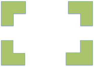
For this activity, we learned about the Gestalt Theory and the different Principles that it includes: Closure, Proximity, Similarity, and Continuity. We were then asked to go to PowerPoint and make a simple image of one of the Principles. Once we were finished I went to Photoshop to crop my image from it's background. My image describes the principle of Closure. This principle says that "we attach meaning to visual displays." The viewer can see that this is the Closure Principle because of the shape that the eye forms by itself when looking at the piece as a whole. In reality, there are 4 oddly cut out squares but when the eye sees them together it forms a full rectangle in the middle. I enjoyed this activity because I learned something new about the different ways an eye can visualize and make something appear real when it's only an illusion. 

Wednesday, February 23, 2011

Composition: Critical Reflection Section 1

Connection: 

I think that the elements in my blog are thematically connected. I use titles to introduce my pieces and activities. I also use introductory, middle, and concluding sentences that connect my thoughts and the pieces I display. I use words like "original" and "new" so one can clearly distinguish between what pieces come first and so on.  My pieces are very much connected with each other. My titles are in bold which help to organize the post, and draw attention to what is important to pay attention to for that section. My posts are also in chronological order so one can easily follow them. I purposefully have breaks between activities to indicate my movement from one subject to the next which helps to connect the piece as a whole. For example, in my "Horizons" exercise I make a break between the horizons examples and the Golden Section to show my movement from one theme to the next. Finally, there are strong visual connections throughout my design. For instance, my font color is consistent which brings the design together. Also, my background is a soft pink/faded white which fits in with the font. My descriptions are always before and after pictures I upload, and everything is aligned in the middle to stay consistent throughout the blog.

Alignment:

I have thoroughly checked my alignment within my pieces to make sure nothing has been overlooked. My alignment is consistently in the center with a touch of variety. For example everything is aligned in the middle except for my ruler of the Golden Section which is flush-left. My downfall is that I express how to enforce the message of my designs within my descriptions but not so much in the design alignment itself. I could do better in the future to ensure my message is clear with more movement opportunity of my designs. I allow the proper amount of space between each piece and theme so nothing is overly cluttered or overly spacious. In looking at my alignment, my clients would probably tell me to change my patterns a little bit to establish more of a variety. But on the other hand, center alignment pleases the eye because it allows everything to appear right in front of one's vision rather than having them search for everything. I could do better in different levels of importance, rather than make them all appear to be equal. That would make the most aesthetically pleasing piece.

Priority:  

I took a break and came back to my computer. I found that I would indeed keep reading this blog for the amount of color sustainability and variety. Once the color caught my eye, I began reading and found that there was enough information mixed with personal emotions to keep me captured within the text. There is clear and appropriate hierarchy within the text. To use the example of my Titles and text again, the Titles are big and in bold to catch the audience's attention. There is good balance of color and value. I mix the background color well with my text color. And my pictures fit well with soft hues or vibrant hues when called for. The visual flow is pleasing in that nothing stands out or feels out of place. I am able to follow through the entire blog without feeling overwhelmed, or pulled in opposing directions. Each item flows swiftly into the next.


In evaluating my own work I'd say my alignment needs the most work. I could make my work stronger by using more variety when a piece needs the most attention. Everything else goes above and beyond the expectations of a blog. I have the right balance of colors, and every segment is arranged in strong hierarchy typically from original works to altered and improved works. I enjoy my work and look forward to what comes next, I hope everyone else does as well!

Tuesday, February 22, 2011

Composition: Color and Emphasis

Activity 7: Color
 
We used images in Photoshop for this project. We started with one simple image that we could easily multiply and manipulate. My image was a pair of cowboy boots that I took from Stolkvault.net. I  used the magic wand tool to select the image and paste it onto a new slide, then tripled the image so the original image looked like this:


We were then asked to significantly change the color of one of the images. This was done to allow viewers to focus on the colorful pair and make the image more visually appealing. I highlighted the middle pair of boots because the middle is often a main focal point for the eyes. I then changed the hue of the brown so it focused into a deep green. My final image looked like this:


I was excited to do this project because I love working with colors and pushing the boundaries to new images. Color really helps an image to stand out above the rest and make a statement. That was what I was aiming for with the middle pair of boots being green. Middle tends to be in the spotlight!


Activity 8: Emphasis


We were asked to choose another image; this time I chose it from Google.com. This image had to be of a street scene with people and objects. I chose a picture taken from Tokeyo's "Time Square". The original image looked like this:


Once we chose the image we were asked to make it black and white, or sepia. To do this I used the magic wand tool to select what object I wanted emphasized. Then I selected the inverse of the tool so that everything except my object turned to black and white. My final image looked like this:


This activity was to show us the value of emphasizing an image, not just with color, but lack of color and the importance of placement and emphasis within an image. I chose to highlight the billboard sign because I thought it captured the idea of Japan the best. I've never been there, but from what I know about the culture is that their buildings are very interestingly designed and their artwork and cartoons are extremely unique. I thought the billboard of the Japanese caricature captured all of that. It is in a place that might otherwise be overlooked when the image is in full color because the picture is so busy, so to ensure I drew attention and focus to it I left it colorful. I think the black and white altered picture is a lot stronger than the colorful picture. It lessens the business of it, and captures the most important part. The second one is the more aesthetically pleasing to my eyes and hopefully to everyone else's!