Activity 7: Color
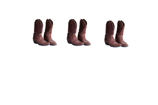
We used images in Photoshop for this project. We started with one simple image that we could easily multiply and manipulate. My image was a pair of cowboy boots that I took from Stolkvault.net. I used the magic wand tool to select the image and paste it onto a new slide, then tripled the image so the original image looked like this:

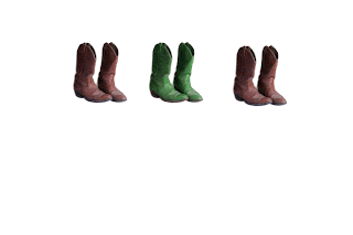
We were then asked to significantly change the color of one of the images. This was done to allow viewers to focus on the colorful pair and make the image more visually appealing. I highlighted the middle pair of boots because the middle is often a main focal point for the eyes. I then changed the hue of the brown so it focused into a deep green. My final image looked like this:

I was excited to do this project because I love working with colors and pushing the boundaries to new images. Color really helps an image to stand out above the rest and make a statement. That was what I was aiming for with the middle pair of boots being green. Middle tends to be in the spotlight!
Activity 8: Emphasis
We were asked to choose another image; this time I chose it from Google.com. This image had to be of a street scene with people and objects. I chose a picture taken from Tokeyo's "Time Square". The original image looked like this:
Once we chose the image we were asked to make it black and white, or sepia. To do this I used the magic wand tool to select what object I wanted emphasized. Then I selected the inverse of the tool so that everything except my object turned to black and white. My final image looked like this:
This activity was to show us the value of emphasizing an image, not just with color, but lack of color and the importance of placement and emphasis within an image. I chose to highlight the billboard sign because I thought it captured the idea of Japan the best. I've never been there, but from what I know about the culture is that their buildings are very interestingly designed and their artwork and cartoons are extremely unique. I thought the billboard of the Japanese caricature captured all of that. It is in a place that might otherwise be overlooked when the image is in full color because the picture is so busy, so to ensure I drew attention and focus to it I left it colorful. I think the black and white altered picture is a lot stronger than the colorful picture. It lessens the business of it, and captures the most important part. The second one is the more aesthetically pleasing to my eyes and hopefully to everyone else's!


No comments:
Post a Comment