Activity 4 and 5: Grouping and Theme
I chose to theme unity this way because to me, the meaning of unity consists of thoughts like: togetherness, closeness, watching out for others and being supportive. Immediately I thought of a circle. It represents all of what I just talked about. A circle brings everything together and in essence "unites" what is separate into a whole. Light green seemed a warmer, more hopeful color to me which is why I chose it to help elaborate my point.
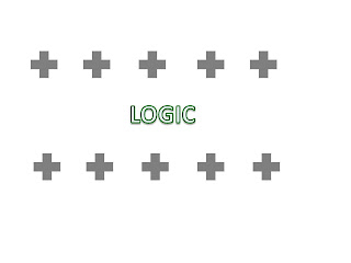
Logic represented a pattern to me. For instance, being able to think structurally, and orderly and make sense of an abstract idea. I used plus signs to unify the theme of logic with that of education. Education and learning helps one to understand something and make sense of it; hence being logical. I aligned the plus signs in rows on top of each other to represent a line. To me, lines lead to strategic and abstract thinking because one can do so much with them. I chose grey to represent the fact that logical thinking seems black or white, but grey is often the answer. Riddle me that :)
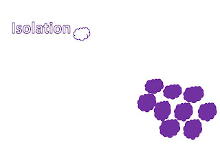
I chose clouds to represent isolation because when I see them in the sky they float silently by themselves, almost independently. When I think of isolation I think of singling one out. Making one feel cold and unwanted. Like they have to be independent and on their own. Hence why one cloud is white and floating by itself, shriveled up and alone while the others are clumped together. The purple helps emphasize the connotation of defeat. I chose a darker purple to emphasize icy-coldness.
Bigger is better when intimidating is the plan. I chose to big suns to "overrule" the smaller ones. The sun in the sky seems to be the most intimidating when one looks up and gets struck by beams of light. Almost like punishment for defying the "ruler above." This is why I used the sun as my tool for intimidation. Yellow resembles power, which is why I chose the color. Many kings, rulers, and nobles have goldish-yellow jewelry, crowns, artifacts, etc that exacerbate their nobility. Intimidation is power.

The structure of this piece is just simply that escape means to run away. I angled the lightning bolts as if they were in attack mode, and the word itself was trying to evade the harm that was coming. Angling the bolts gave a stronger connotation to the word, that seemed to emphasize urgency. Which is the point when one is escaping, they want to leave as soon as possible. Red signified an urgent color. Red is as if something is dangerous or deadly, like blood. So I contrasted the red with black letters, signifying inevitable doom if the plan to escape fails.

When one is celebrating it is generally known that one is joyous or happy. This is why I chose smiley faces. To resemble celebration. The smiley faces are ordered in diagonal groups because the vibe of this grouping is that of liveliness and joy. Everything that a special occasion entails. Pink seemed to be a vibrant color that makes one feel excited which is why I chose it to represent celebration.
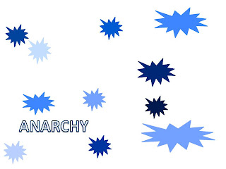
Anarchy gives off the connotation that something is in uproar. Everything is disorganized and run a muck. This is why I chose explosions to represent the definition. They are all different sizes and all over the place to represent the disjunction. They are all different colors of blue to show that nothing is orderly or put together. Blue seemed to be an ominous color which is why I chose it as the base color to represent anarchy.
The purpose of doing this activity was to experience what Krouse was talking about when he expressed the importance of grouping. We were asked to make 7 different Powerpoint slides with a different word in each slide. We were then asked to organize 10 simple shapes that expressed the word through grouping. I tried to pick colors and shapes that best depicted the word given. This activity showed off my use of Powerpoint skills as well as my capability of thinking abstractly about grouping. Grouping isn't always center-based, it can be up, down, or sideways as long as there is a similar theme running through the entire work. Doing this project gave me a new perspective on how to think about words and their connotative meanings.Comparing my work to others I would not say that it is as good as some, but for that matter I think once you understand my thought process you will also understand why I made my pictures the way I did.


Carolyn, great pictures! Go ahead and tell us more about your thinking. Be sure to write a narrative for each visual that explains your technique. For example, why did you choose the particular symbols and grouping arrangements? What do you think about the quality of your own work in terms of conveying the intended message?
ReplyDelete