Sunday, April 17, 2011

Composition: Critical Reflection Section 3

Clarity
 I think that literal, stylistic and thematic messages are all presented in the piece. If you look at my thought process in my narratives, you can see what makes the words literal, what makes the words stylistic (my additions and alterations) and what makes them thematic. Each piece of the typographical conveyance activity is working toward appealing the the audience. Getting them to feel how I feel, or even if it's something different that's fine as well, as long as my piece is moving in some way, shape or form I think I did my job. For example in my "lightly" piece, once I took a step back I truly felt more calm and peaceful. The colors, texture, design, and more all worked together to achieve something appealing that internally allowed me to feel an emotion. There is alwys possibility of misinterpretation of any one's piece because everyone thinks and feels differently. Something that I like and is creative to me, may be boring and unoriginal to someone else. I can only do my best to what feels right to me, and hope that majority of who sees my work is overall pleased with it. I think I did a good job of balancing the attention. I don't think I have more than one message in any of my pieces. I think my impact is at the perfect amount. Of course, I'm sure there could be changes but I like the way each piece makes an impact. Some pieces like the "atom", "lightly" and "pillow" are all very creative and at the same time reflect a simple message, while other pieces like "brick" and "xxl" are on the more simplistic side. Overall I think I did a nice job balancing the weight and message of all of the pieces to make sure that the whole is just right for the viewer to look at.

Audience
The target viewer for this piece I think is my classmates and professor obviously, and then also people who like to view different styles of artwork. People who like to compare and contrast and be imaginative would like my artwork. There are many visual tastes working together with this graphic; some simple, some complex, some with lots of variety and some with little variety. I have a spectrum of tastes covered in this piece. In order to be sure of my conclusions I can have others review my work and tell me how they interpret it and get outside perspectives. I think the tone of my overall typographical conveyance piece should be open-minded. I want people to see my thought process and my work, and then come to their own conclusions. I think I did that with my work, I made sure to be detailed, but also leave room for someone else to get creative and say "I like that, but what would I do?" I think people would respond to everyday lingo, which is what I've used throughout my entire blog and this piece. If it was too art-driven that would limit my audience, but the point of this class is to show I've learned something so I do have some art lingo in here as well. People always prefer colors that stand out and grab your attention more than they prefer soft colors but it also depends on the mood of the person and the mood the piece is trying to convey. For "lightly" i used light colors because that's what the emotion called for, but for "brick" I used a darker color because of the mood I was trying to convey. I do not think the concept of this piece talks down to my target audience at all. I think I explained what I know, and how I know it, and gave people a basis of how to understand my personality and my own thoughts. This piece can provide insight and explanation for those that desire to know,  and color and creativity for those who desire to look and feel. I think this design stands apart to some extent because it's my own interpretation. I also know that a lot of people have the same thought process sometimes, so ideas can overlap but overall the way this piece was put together is 100% original for the audience to explore. If this piece were a person it would behave collectively because at the end of the project it all comes together to achieve one goal, it would be a colorful person with their own style and individuality because that's what this piece represents to me, and it would be fun-loving because this piece adds enough creativity to pop and stand out. I think the target audience would really like this person. Everyone wants to know someone different, and get another perspective, that's how we grow off of one another!

Purpose
This piece is supposed to reflect my understanding of most of what I've learned this year. How does color work and effect a piece? How does font change the feeling? How does style and texture and design alter an emotion? All of these things I considered when doing this activity. This is not meant to sell a product, it's meant to sell me. I am promoting myself and my individuality and my education of what I've learned this year. This piece has been adequately narrowed so that it can be given as much attention and power as it deserves. It draws a broad audience and touches a lot of different emotions, and also is aimed at the people in my class who can compare and contrast with me as to what makes my piece good and bad, compared to others. 


Overall, this piece was one of the most difficult but also one that I learned the most from. I know a lot more than I think I do, and even though I may not be the best with computers or programs yet, I am constantly improving and learning to challenge myself. I think from the beginning of the year to now I have come a long way and am very impressed and inspired by my own progress.

Composition: Typographical Conveyence

Activity 17: Typographical Conveyence (Putting it all together!)


For this section we were asked to put all of our knowledge from the semester to complete this final activity. We were given 6 words. With those 6 words we had to alter the font, lettering, shape, color, etc to best convey what the word means. I used PhotoShop to do all my work. Here is what I came up with:


This was a hard word for me to identify with because I have not shred anything in a long time. 
For the word "shred" I chose to keep the color black. It was easier to see the white when I was attempting to look like I was "cutting up the words." Shred makes me think of something messy, or discombobulated and that is why the shredding of the words looks crooked and a muck. The scissors were made bigger than the word to show that "shredding" is a bad thing. The scissors are a scare tactic that they are larger than the word. They are doing damage. I chose a font that would be easy to adjust to show off the changes I made. A serif font appealed to me more than a sans serif because I like the punch to the letters with the feet. If the letters were smooth it would have taken away from the aesthetics I think.

When I think of XXL I think of the logo on a tshirt. I didn't know quite how to go by describing that other than first of all, doing the obvious and making the word just as big as it's definition. I used black because typically logo's are black, and black is a daunting color; much like things that are extra extra large. I used serif font again because it helped punctuate the feel of the words. Bigger than big means business and that's what I was going for; larger than life feel. 


I changed the color to a deep mahogony/red to show off the connotation of the word. Bricks are typically a deep red color so that's what immediately came to my mind. I then chose a font that would show off my design of the word. I used the Photoshop manipulator tools to change the display of the word to look like a pattern of bricks. I spaced the individual letters out to give it more of an effect. I used a sans serif font because I thought it would help to display the brick pattern better than a serif font would. It almost looks like I cut these letters out of a brick wall and that makes me proud of my work. 


When I think of atoms I think of a lot of things. The word has a scientific feel to it so I chose a font that I thought one would find on scientific readings or diagrams. Something with structure but also with interest to the audience. I took the atom symbol from Photoshop and used it to form the "O" of the word which I think really makes the word come to life. I spaced out the letters in this one too so the audience could get a "structured" vibe. The letters closer together didn't have the same effect. I added red because when I think of something scientific I think of the colors black and red, serious and studious, but eye catching as well. I think I did a very good job giving off the feel of this word.

Lightly is always a fun word to get creative with. I chose a font that would display elegance and gracefulness. When I think of objects that are light I immediately thought of clouds. This is why I have a picture of a sun, to balance off the word "floating" behind it. I shifted the word up to add the effect of being in the sky. I also used the texture tools in Photoshop to change the texture of the word to look like a light breeze was blowing through the peaceful "clouds."  I changed the color obviously to a serene blue that would reflect clouds or a breeze. I think everything I did for this word pulls the meaning together in an aesthetically pleasing way.


This word I also had some difficult with, but am almost the most pleased with this word as well because of my perseverance. It's always hard to graphically depict the word "pillow". When I think of pillow I think soft, fluffy, maybe a bed, or laying down. I took a picture of a square and used tools in Photoshop to bend the square into a more "fluffy" look. I changed the colors to something you would maybe see on a bedspread. I used a font that was soft, and comfy in a way (the sans serif had that effect to me). I then layered the word on top of the pillow to look like it was laying down. This was the toughest word but the most fun for me to discover how creative I could get!


Tuesday, April 12, 2011

Composition: Critical Reflection Section 2

Connotation

Overall, I am very pleased with my work on this blog.It's one thing to evaluate your own work so I will try to stayed as unbiased as I can be. My themes and visual components all tie in very well together, I think. For instance, on the color echo activity I demonstrated a great job of matching theme with visual aspects. I chose the most important parts of the lips and used them as inspiration for a multi-colored backdrop. In order to evaluate if there is a thematic pattern one needs to establish what that is. I would say my wholistic theme is creativity, and appeasement to the eye. And as a whole, my blog uses every sub-component: fonts, textures, pictures, drawings, words, colors, etc to accomplish the goal of creativity and sensory pleasure. Some, more than others; for example the Emotional Design did an extremely good job of using a bunch of sub-components to complete the final effect. I think this theme is accurate in that it is not too specific or too broad. We do so many projects in class it's hard to find a narrow goal. You can be more creative when you think in broader terms. I don't think my blog needs to adjust a lot of it's components. As a whole it accurately depicts what I want it to depict. I want my work to speak for itself (with help from the text), and if it can't do that than i didn't do my job.I show my logo's, etc on my work to guide others in what they should be looking at or evaluating so I think I am right on track.

Attributes

As of this point in my work, I am very satisfied with the visual weight, colors I use, structures, and presentational style. It reflects enough of my character that one can not only discover my creativity, but can discover a bit about me as well. In the entirety of my blog, the background fits with the elements on my page. In specific instances like in the color echo or the emotional design, or even the hue and saturation to which there was no backdrop other than the one provided for my blog, I present good judgment with aesthetics. The backdrops are enough that they give my designs a point, but at the same time it brings everything together to present the importance of my designs. Color options have definitely been explored, especially in the case of the hue and saturation activity. The color scheme of each of my elements seems to always even out in my total blog, so as of now I don't want to change my work. I'm happy with the message they each convey alone and together. Texts are large enough, activities are appropriately intended for specific audiences, and the color of my type brings a homey, warm feeling to my blog. I wouldn't want to change fonts unless it was for the font activity. The same font is soft enough to be easy to the audience to see, but also hard enough that people want to read what is written. 

Placement

If my elements ever needed to be drawn attention to I make sure I draw attention to them. When I have multiple photos for an activity I switch between left and right layout so it keeps the eye moving. Middle I found to be too consistent and boring last evaluation. If I'm unsure as to whether the audience will catch the importance of something I reiterate it by typing it in my text, or drastically alter that part of the picture. In any case, what's needs attention gets it in my blog. I like the spacing between my work because one piece and it's text shouldn't be grouped with another piece and that text; the flow wouldn't amount to the way I have set it up. I alter, crop, rotate, etc whatever elements I need in order to make it appealing. I normally place my headings in the center and then stem from there. A little repetition can be good, but a change of pace can make things exciting and stimulating. Placement is what I have worked on most this section. I am very happy with the way it has turned out.

The CAPs questions  keep me on my toes when evaluating my blog. They make me take one more step further back and really be honest with myself. With this help, I have been able to improve since the beginning of the semester and that means the world to me. I came into this class dreading my uncreative brain and worrying that I would fail. I have come to a place now where I am confident that I can accomplish anything, and I look forward to coming to class everyday to try new things. 

Thursday, April 7, 2011

Compositon: Combing Fonts and Images

Activity 16: Combining Fonts and Images


For this activity we were asked to put all of our knowledge of fonts and imaging together. We worked in Photoshop to create a logo with our own fonts and an image from the "custom shape" tool.


I chose the crest image which inspired my company logo. I used a font that was scripted and smooth which reminded me of royal handwriting. The word royal inspired my idea for the use of purple in the image because purple can invoke a royal feeling. Because of my good use of color and font I would definitely stop in this shop to look for my furniture. I would assume when I walked in to be treated like royalty. Who wouldn't want to feel like that!?

Composition: Word Portraits

Activity 15: Word Portraits

The point of this activity was to demonstrate the way one can amplify words mean more than just letters on a page. We were asked to pick 2 fonts that we could accurately describe by altering the words in any way we could. Then we were asked to pick 2 fonts that we would contradict by altering them. I altered my fonts through PowerPoint.


Descriptor words:


The font I chose for this is called "American Typewriter". I think my words describe this word very well. When I think of typewriters, I think back to the old days when people spent hours in front of that big machine trying to type 4 sentences because one wrong letter and you had to start from the beginning. People had to learn to be very articulate early on so they spent less time messing up and more time getting their work done. This why I decided to use studious. The brains that went into using a typewriter must have been much more advanced than now when the computer pretty much thinks for you. I used the descriptor historical because technology has become so advanced that typewriters do seem ancient at this point. I like the font color the way it was. It's classic, which is what I was trying to capture with this word. Also, I underlined studious because that was the main point I wanted people to pay attention to, and if I didn't change the color, I had to get people's attention somehow. I put a period at the end just for nostalgia. When I think of historical writing I think of how many more periods were used back then.


This font is called "Chalkduster". It obviously explains why I used the word childish to describe it. Chalk and kids go hand in hand. I used a light, fun color to emphasize the youth of this word. I picked a lighter color because it also seemed to resemble that of a crayon outline, which only helps to emphasize more the description to this font.


Contradictory words:


This font is called "Brush Script std". This font reminds me of elements like: graceful, elegant, calm; almost like a ballet dance. This is why I chose to contradict it with Abrupt. Abrupt is harsh, unfriendly; everything that elegance is not. I also kept this black because black is a very standout color when it's against light backgrounds.


This last font is called " Cracked". The title of the font may make sense with my word choice, but the explanations of why I chose this word to describe it will make sense in a minute also. When someone says they have OCD, they are sometimes saying they are extremely neat, or that they have to do routines in a certain way; extremely organized. So when I use this chopped up font that doesn't connect to make the letter a full letter, or  is this lavish red color, and the spacing and word size are not equal; this describes everything that is not clean, neat, or crazy orgaized. Hence why my word is contradictory to the "cracked" font.


Tuesday, April 5, 2011

Composition: Emotional Design

This activity was done to see how creative we could be with our emotional appeals. We were asked to take an ordinary object, and construct an emotion out of it by altering it in any way we felt fit. My partner Michelle and I, took an every day lava lamp from Google Images.


We picked the emotion happiness, which evolved into a sort of psychadelic happy. We targeted an audience of young adult/college students because they would be the most likely to use this object. Since we fall within that group it was easy for us to pick out the things that 12-25 year olds appreciate. Color, imagination, abstract ideas; so we went from there.

Next, we altered the lava lamp in PhotoShop. We highlighted the layout and used the magic wand tool to cut out the form. Then, we used the paint tool to fill it in to a solid black color. We then took out all the colors that would fall into a lava lamp and used the gradient tool to stretch the color out. We formed the colors into abstract hair above the shape so it started to simulate a Rastafarian person. We then edited the background to make the picture appear fuller. A light blue to mix in with the gradient colors we pulled out. We then added the cord of the lamp, but we maneuvered it with the shape tool to spell out what our emotion was. The cord also resembled a semi-smile out of the Rastafarian face, to me at least. Since we targeted a younger group it seemed more appropriate to go abstract which is why our form turned into a Rasta-man.  All in all I think we did a good job of pulling out our emotion. It took a while, but with hard work and dedication we made our shape into something unique that definitely makes the viewer feel a sense of an emotion when they look into it.

Our final image:

Wednesday, March 23, 2011

Composition: Color

Activity 14: Color Echo


For this activity, we were asked to find a picture with a simple background. I found the image of a pair of lips on Google. I chose it because it had interesting colors that would fit nicely for this assignment. I used Photoshop for the rest of my composition. I used the magic wand tool to cut out the lips from their background. I then used a second layer to create the new background. The assignment was to echo the colors from our original picture, onto a background in which we would put it all together and make a poster/sign, etc. My original picture looked like this: 


In order to echo the exact color of the lips I decided on making a background that focused on the most important colors. I chose the dark purple, the magenta/ hot pink, the golden yellow, and the orange yellow.  Once I picked out the colors and made them exact shades of the original, I then dimmed and made the background a little transparent to soften it because I wanted the main focus to be on the image.Then, I added text in which I chose a soft purple/pink for the color. I thought it was important to focus on a color that matched but was a little offsetting so it could be viewed as equally important. I used a font that was bold to signify the importance of the message, but that was also fitting to what the words said. I thought the edginess of the letters brought the whole image together. My final result looked like this:


This was by far the most challenging exercise. It is extremely hard to color echo, but once done right the final result is very rewarding. I learned that sometimes using similar colors on an entire image can bring the whole message together more than just text and a plain background. If you really want to spice up a poster this would be an excellent way to grab someone's attention.


Activity 13: Saturation and Hue


In this activity, we were asked to focus on color. We were asked to pick out a picture from the internet with good color in it. I chose this original picture of a box of crayons from Google (seen below). We were then asked to go into Photoshop and alter the hue, saturation, and value (lightness or darkness).


                                                                                     Hue:

I chose to alter the hue to -66. I thought it would be a nice contrast to the original picture which was already so bright. I think it makes a statement to darken the hue because all of a sudden crayons don't look that exciting to play with. If I was a kid looking at a commercial to buy crayons, I would want the vibrant option rather than the one presented here. The tone is darker and more humble than the optimistic and exciting option of bright colors presented in the original.


                                                                                    Saturation:


The saturation example I did next is the opposite of what I was demonstrating with the hue. I chose to alter the saturation to +47. This option stood out to me because the vibrance came alive. It wasn't too saturated so that the picture lost it's aesthetic aspect. This is my favorite demonstration of color. You can really see the variances in colors which is what I was ultimately trying to accomplish.


                                                                                        Value (Lightness):

The value aspect of color shows off how white or black you can make a picture. If I had to choose I would prefer a whiter version of the original crayon picture, like the one displayed here, because the blacker one is almost impossible to see. With so many colors originally, it becomes difficult to separate and therefore black just becomes mush. This example showed me that I would rather have a color variance to a picture because lightening it just makes it dull. The activity becomes lost in this example.


I enjoyed this example simply because I love playing with colors. I have a much better understanding of what to look for in a good colorful picture, or what to avoid when I'm constructing my own picture with multiple colors. For example making the image too negatively hued or too light bring about unpleasant aesthetics, and a saturated picture can sometimes be better than an unchanged image.

Monday, March 21, 2011

Composition: Legibility and Text Safe Areas

Activity 12: Legibility 


The class was asked to make fake greeting cards for this activity that included a semi-simple backdrop with text on top of it. I chose clouds from Google Images, because they are a relaxing scene. I wrote the word "Welcome!" on my greeting card as well. I wrote it in bold font to offset the blue of the backdrop, and I used sans serif font (meaning the words did not have feet on them). I felt that this made the card more inviting. The text had a bit of comic style to it to also emphasize relaxing, as if this were a greeting card from a hotel or promoting a place of travel. I wrote the text on the bottom left hand corner to add aesthetics of flow with the picture. The clouds look as if they are shifting from left to right and by placing the text where I did, it allows the eyes to keep the same pattern of view. My result looked like this: 


I enjoyed doing this project because it helped me to understand the importance of text and legibility. If someone wanted to make a greeting card with clouds and used soft blue font, and was hoping to use it as an important business venture, no one would take them seriously because they did not put enough "time and effort" into making their card seem realistic. It would look sloppy and incomplete, and therefore give a bad look to that business. I use this example in my head to make sense of an abstract situation for there are many more examples that people use text for in the every day world. Communication is how the world functions and keeps society moving. Text is a channel for that communication, hence its importance is monstrously important for every day life.


Tuesday, March 15, 2011

Composition: 3D

Activity 11: 3D images

We used this activity to buid a 3D image inside the 3D world SecondLife. We were asked to construct an object inside this real world simulation website of our choice. I chose a cone. I altered the object by changing its gradient to Spanish tile. I then made it transparent as well as emphasized it's shininess. I rotated it so it's tile marks showed more to the people which allowed the uneven sections to reveal themselves, and lengthened it so it was taller than all the avatar present. My final image looked like this:


This activity taught me how to operate inside a 3D world. It opened my eyes to graphic design which is quite an interesting task. I found as I was producing my object that graphic design is a bit of a tedious task for me, but I appreciate the effort that so many people take to make websites, etc to look as good as they do. It is extremely hard work to make something look realistic, on top of which being aesthetically pleasing. I think that I did a decent job for one who had never even seen a website like this before let alone operate in it. 3D life is a lot more challenging than I ever thought.

Friday, February 25, 2011

Composition: Icons

Activity 10: Icons

     For this exercise we were asked to focus on the importance of icons. We were asked to find an image of an object and identify the object's most important features. I picked a syringe from Google. I discovered that the most important aspects to any syringe are its needle, the pressure pusher, and the measurements. Then, we were asked to transform the image into our own interpretation of an icon. 


My final image looked like this:  


 I took the most important and identifiable parts of the syringe and made it into an aesthetically appropriate image for others to look at. It conveys a medical message that could lure people in to "get their blood drawn, get tested for various symptoms, diseases,etc." It's comic enough that children could appreciate it for it's visual aspects , but it's real enough that adults can appreciate what it means.


 Krause says: "The ultimate goal of an icon is to convey a message-quickly, clearly, and in a manner that is aesthetically appropriate for its purpose and target-audience" (p.155). I think I followed and understood what Krause meant with my interpretation of my needle icon. I learned from doing this activity that it takes a lot of thought and effort to produce a good icon. This activity was hard for me to get through but I'm overall pleased when I look at the final result.


Thursday, February 24, 2011

Composition: Gestalt Theory

Activity 9: Gestalt Principle-Closure


For this activity, we learned about the Gestalt Theory and the different Principles that it includes: Closure, Proximity, Similarity, and Continuity. We were then asked to go to PowerPoint and make a simple image of one of the Principles. Once we were finished I went to Photoshop to crop my image from it's background. My image describes the principle of Closure. This principle says that "we attach meaning to visual displays." The viewer can see that this is the Closure Principle because of the shape that the eye forms by itself when looking at the piece as a whole. In reality, there are 4 oddly cut out squares but when the eye sees them together it forms a full rectangle in the middle. I enjoyed this activity because I learned something new about the different ways an eye can visualize and make something appear real when it's only an illusion. 

Wednesday, February 23, 2011

Composition: Critical Reflection Section 1

Connection

I think that the elements in my blog are thematically connected. I use titles to introduce my pieces and activities. I also use introductory, middle, and concluding sentences that connect my thoughts and the pieces I display. I use words like "original" and "new" so one can clearly distinguish between what pieces come first and so on.  My pieces are very much connected with each other. My titles are in bold which help to organize the post, and draw attention to what is important to pay attention to for that section. My posts are also in chronological order so one can easily follow them. I purposefully have breaks between activities to indicate my movement from one subject to the next which helps to connect the piece as a whole. For example, in my "Horizons" exercise I make a break between the horizons examples and the Golden Section to show my movement from one theme to the next. Finally, there are strong visual connections throughout my design. For instance, my font color is consistent which brings the design together. Also, my background is a soft pink/faded white which fits in with the font. My descriptions are always before and after pictures I upload, and everything is aligned in the middle to stay consistent throughout the blog.

Alignment:

I have thoroughly checked my alignment within my pieces to make sure nothing has been overlooked. My alignment is consistently in the center with a touch of variety. For example everything is aligned in the middle except for my ruler of the Golden Section which is flush-left. My downfall is that I express how to enforce the message of my designs within my descriptions but not so much in the design alignment itself. I could do better in the future to ensure my message is clear with more movement opportunity of my designs. I allow the proper amount of space between each piece and theme so nothing is overly cluttered or overly spacious. In looking at my alignment, my clients would probably tell me to change my patterns a little bit to establish more of a variety. But on the other hand, center alignment pleases the eye because it allows everything to appear right in front of one's vision rather than having them search for everything. I could do better in different levels of importance, rather than make them all appear to be equal. That would make the most aesthetically pleasing piece.

Priority:  

I took a break and came back to my computer. I found that I would indeed keep reading this blog for the amount of color sustainability and variety. Once the color caught my eye, I began reading and found that there was enough information mixed with personal emotions to keep me captured within the text. There is clear and appropriate hierarchy within the text. To use the example of my Titles and text again, the Titles are big and in bold to catch the audience's attention. There is good balance of color and value. I mix the background color well with my text color. And my pictures fit well with soft hues or vibrant hues when called for. The visual flow is pleasing in that nothing stands out or feels out of place. I am able to follow through the entire blog without feeling overwhelmed, or pulled in opposing directions. Each item flows swiftly into the next.


In evaluating my own work I'd say my alignment needs the most work. I could make my work stronger by using more variety when a piece needs the most attention. Everything else goes above and beyond the expectations of a blog. I have the right balance of colors, and every segment is arranged in strong hierarchy typically from original works to altered and improved works. I enjoy my work and look forward to what comes next, I hope everyone else does as well!

Tuesday, February 22, 2011

Composition: Color and Emphasis

Activity 7: Color
 
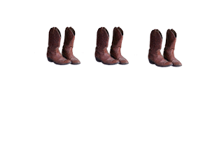
We used images in Photoshop for this project. We started with one simple image that we could easily multiply and manipulate. My image was a pair of cowboy boots that I took from Stolkvault.net. I  used the magic wand tool to select the image and paste it onto a new slide, then tripled the image so the original image looked like this:


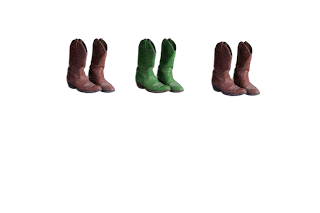
We were then asked to significantly change the color of one of the images. This was done to allow viewers to focus on the colorful pair and make the image more visually appealing. I highlighted the middle pair of boots because the middle is often a main focal point for the eyes. I then changed the hue of the brown so it focused into a deep green. My final image looked like this:


I was excited to do this project because I love working with colors and pushing the boundaries to new images. Color really helps an image to stand out above the rest and make a statement. That was what I was aiming for with the middle pair of boots being green. Middle tends to be in the spotlight!


Activity 8: Emphasis


We were asked to choose another image; this time I chose it from Google.com. This image had to be of a street scene with people and objects. I chose a picture taken from Tokeyo's "Time Square". The original image looked like this:


Once we chose the image we were asked to make it black and white, or sepia. To do this I used the magic wand tool to select what object I wanted emphasized. Then I selected the inverse of the tool so that everything except my object turned to black and white. My final image looked like this:


This activity was to show us the value of emphasizing an image, not just with color, but lack of color and the importance of placement and emphasis within an image. I chose to highlight the billboard sign because I thought it captured the idea of Japan the best. I've never been there, but from what I know about the culture is that their buildings are very interestingly designed and their artwork and cartoons are extremely unique. I thought the billboard of the Japanese caricature captured all of that. It is in a place that might otherwise be overlooked when the image is in full color because the picture is so busy, so to ensure I drew attention and focus to it I left it colorful. I think the black and white altered picture is a lot stronger than the colorful picture. It lessens the business of it, and captures the most important part. The second one is the more aesthetically pleasing to my eyes and hopefully to everyone else's!


Thursday, February 10, 2011

Composition: Alignment


Activity 6: Alignment

For this activity, we focused on alignment. I chose the liquor bottle because I thought it stood out more than just a picture of a cat would, per say. It definitely catches the eye's attention. Secondly, I focused on center alignment. I thought the text right below the bottle made the image a lot stronger. It allows the eye to flow naturally from the picture of the liquor bottle straight to the "message" which was my main focus of this design. Finally, I made the logo font smaller than the picture so it wouldn't take away from the main point. I aligned the logo underneath the picture to pull the piece together.This piece is not scattered and disorganized, off balance, or overly lavish. These reasons make this a good example of  alignment; it follows a specific pattern, of centrality in this case, but still projects an interesting point of view. I enjoyed working on this activity because I never really understood the importance of alignment in a picture until now. It was exciting to produce an image that people enjoyed.

Wednesday, February 2, 2011

Composition: Grouping and Theme

Activity 4 and 5: Grouping and Theme


I chose to theme unity this way because to me, the meaning of unity consists of thoughts like: togetherness, closeness, watching out for others and being supportive. Immediately I thought of a circle. It represents all of what I just talked about. A circle brings everything together and in essence "unites" what is separate into a whole. Light green seemed a warmer, more hopeful color to me which is why I chose it to help elaborate my point.
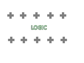
Logic represented a pattern to me. For instance, being able to think structurally, and orderly and make sense of an abstract idea. I used plus signs to unify the theme of logic with that of education. Education and learning helps one to understand something and make sense of it; hence being logical. I aligned the plus signs in rows on top of each other to represent a line. To me, lines lead to strategic and abstract thinking because one can do so much with them. I chose grey to represent the fact that logical thinking seems black or white, but grey is often the answer. Riddle me that :)
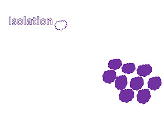
I chose clouds to represent isolation because when I see them in the sky they float silently by themselves, almost independently. When I think of isolation I think of singling one out. Making one feel cold and unwanted. Like they have to be independent and on their own. Hence why one cloud is white and floating by itself, shriveled up and alone while the others are clumped together. The purple helps emphasize the connotation of defeat. I chose a darker purple to emphasize icy-coldness.


Bigger is better when intimidating is the plan. I chose to big suns to "overrule" the smaller ones. The sun in the sky seems to be the most intimidating when one looks up and gets struck by beams of light. Almost like punishment for defying the "ruler above." This is why I used the sun as my tool for intimidation. Yellow resembles power, which is why I chose the color. Many kings, rulers, and nobles have goldish-yellow jewelry, crowns, artifacts, etc that exacerbate their nobility. Intimidation is power.


The structure of this piece is just simply that escape means to run away. I angled the lightning bolts as if they were in attack mode, and the word itself was trying to evade the harm that was coming. Angling the bolts gave a stronger connotation to the word, that seemed to emphasize urgency. Which is the point when one is escaping, they want to leave as soon as possible. Red signified an urgent color. Red is as if something is dangerous or deadly, like blood. So I contrasted the red with black letters, signifying inevitable doom if the plan to escape fails.


When one is celebrating it is generally known that one is joyous or happy. This is why I chose smiley faces. To resemble celebration. The smiley faces are ordered in diagonal groups because the vibe of this grouping is that of liveliness and joy. Everything that a special occasion entails. Pink seemed to be a vibrant color that makes one feel excited which is why I chose it to represent celebration.


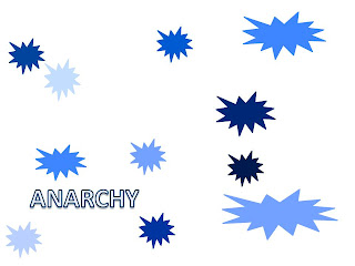
Anarchy gives off the connotation that something is in uproar. Everything is disorganized and run a muck.  This is why I chose explosions to represent the definition. They are all different sizes and all over the place to represent the disjunction. They are all different colors of blue to show that nothing is orderly or put together. Blue seemed to be an ominous color which is why I chose it as the base color to represent anarchy. 


The purpose of doing this activity was to experience what Krouse was talking about when he expressed the importance of grouping. We were asked to make 7 different Powerpoint slides with a different word in each slide. We were then asked to organize 10 simple shapes that expressed the word through grouping. I tried to pick colors and shapes that best depicted the word given. This activity showed off my use of Powerpoint skills as well as my capability of thinking abstractly about grouping. Grouping isn't always center-based, it can be up, down, or sideways as long as there is a similar theme running through the entire work. Doing this project gave me a new perspective on how to think about words and their connotative meanings.Comparing my work to others I would not say that it is as good as some, but for that matter I think once you understand my thought process you will also understand why I made my pictures the way I did.

Monday, January 31, 2011

Composition: Horizon Variations and the Golden Section

Activity 1: Point Placement

The first exercise we did was point placement on a grid sheet of paper. We put dots all over the page so that each of the horizontal and vertical distances to the paper's edges were different. We utilized the Principle of Unequal Spacing in this example. We did this to show that "varied measurements around points of interest tend to heighten the visual interest and energy of the piece and convey a sense of creativity" (Krause 19). This principal allows one to see the more aesthetically pleasing side of a piece rather than staring at it head on. It offers a new way to look and experience something. 

Activity 2: Horizon Variations

Here, we demonstrated the effectiveness of the division of space. It can draw attention to something, or pull us away depending on how you use it. In the first case, we attempted to draw attention to the road's horizon.

The original picture looked like this:   Nothing stood out at this perspective. The road and sky were pretty much equal in distance making it boring to look at, and if you focused straight at the picture there was too much clutter with signs and telephone polls.

We were then challenged to focus more on the road, and my resulting picture looked like this: By cropping the picture it emphasized what the driver might see making it: more focused, more appealing, and by effect I felt as if I was the one driving the car and seeing what I might see if I was actually there.
 

Our next challege was to focus on the sky horizon. The original picture looked like this: This picture was similar to the other original in that there isn't much focus here. It doesn't spark an interest with any one of my senses because of the generalized overview it presents.

I then changed the picture to focus on the sky horizon: I again used the crop tool in Photoshop to draw attention to the upper portion of the picture. This allows my imagination to think deeper into the meaning of the sky, why it was the center of this piece? This is much more pleasing in every sense than the original. It has a purpose.


Activity 3: The Golden Section

The Golden Section was defined by Krause "as an aesthetically pleasing division of space that is often used by artists as the basis for measurements within their composition" (34).  It was then described as a cult-like tool because of how many people have actually acquired the use of this tool over the years.

Our next challenged was to replicate a Golden Section ruler of our own:
 
 We used Photoshop to design a rectangle picture to look like a  13 inch ruler that was divided unequally. One section is 8", and one section is 5" approximately. The ruler divides like this to tie in the overarching theme of unequal spacing. Unequal is more pleasing than equal in most cases. This ruler will help in all of my future design placements as I move forward this semester.

Wednesday, January 19, 2011

Reflection of Google Earth and Geospatial Projects on the Shenandoah Valley Event


Hello all,

 Here's my feedback on the Google Earth presentation. I actually found it kind of interesting. Not to say that it isn't interesting stuff, but it was the kind of information that could easily be really dull and I think all the presenters did a pretty decent job of keeping it interesting. 
  
The kind of visuals I seemed to find myself mostly looking at and critiquing were those that were Representational, like the old historical maps that ended up looking like buildings that were still in tact or around today, and visuals of Anologic value.  The Analogic ones were more of the scientific examples like the in depth examples of rocks that didn't actually show rocks, but they were meaningful in getting the visual across that they were still discussing rocks. The people who created these images were a large group so I'm going to try to remember the best I can; The makers of Google Earth who layed the foundation for what The Geospatial group was doing, The Geospatial group themselves, Sandburg Map Company, and many more that I'm sure I'm forgetting. 
      I think the purpose of showing the visuals they did was to aid in the understanding of the information that was being presented. Typically, these kinds of presentations can become rather dry, and extra visuals can help make it more interesting, which is exactly what they did for me. From what I understand the intended audience  for the visuals as they are normally used is the public who is interested in the geologic aspects of where they live. The basic visuals were from Google Earth so all of society that wants to know more about where they live, or any other place for that matter is the natural general audience, including scientists/geologists/etc. 
     The presentation was a little too scientific for me which makes me think that the presenters assumed that their audience has had a background in this kind of information or has participated/actively involved in geology before they came to the presentation. They talked a little fast, and used words that I'm not familiar with, namely science slang. I didn't really learn any new terminology related to visuals though, just learned big scientific words.
     The visuals were and were not accurate representations of something. There were blueprint visuals which exemplify both these answers. The blueprints showed what buildings were initially supposed to be in the Harrisonburg area and then the men pulled up images of what the space looked like now, and some visuals did not exist/anymore. For example, the old Tannery is now where the main Parking Deck is on campus. The visuals didn't really change my understanding of the subject as much as they helped my understanding. The visuals just ended up showing me that this topic is a lot more complicated than I was prepared for.
    The visuals were presented to us most likely off of a PowerPoint program and shown to us through a projector/Mac computer. The quality of the images was certainly affected by the projector because projectors seem to skew and in this case widen the images from what they normally look like. The lighting was off too, making some slides less appealing than what they would originally appear to be.
    Voices that were more unheard in the visuals seemed to be historians, scientists, my own head voice critiquing, and voices that were actually heard through the visuals were those who were presenting in essence, their jobs, and/or what they have spent so much time and energy creating.
  
Food for thought: Steve Whitmeyer, one of the big brains of this project said eloquently: " A map is an interpretation as much as it is what's actually on the ground." I think that goes for all visuals, they can be representational, or they can stretch the mind and limits of what they are to achieve a whole new meaning or message.